Understanding color
Knowing how colors are created and how they relate to each other lets you work more effectively in Photography. Instead of achieving an effect by accident, you’ll produce consistent results thanks to an understanding of basic color theory.
PRIMARY COLORS
Additive primaries are the three colors of light (red, green, and blue) that produce all the colors in the visible spectrum when added together in different combinations. Adding equal parts of red, blue, and green light produces white. The complete absence of red, blue, and green light results in black. Computer monitors are devices that use the additive primaries to create color.
Additive colors (RGB)
A. Red B. Green C. Blue
Subtractive primaries are pigments, which create a spectrum of colors in different combinations. Unlike monitors, printers use subtractive primaries (cyan, magenta, yellow, and black pigments) to produce colors through subtractive mixing. The term “subtractive” is used because the primary colors are pure until you begin mixing them together, resulting in colors that are less pure versions of the primaries. For example, orange is created through the subtractive mixing of magenta and yellow together.
Subtractive colors (CMYK)
A. Cyan B. Magenta C. Yellow D. Black
RGB COLOR WHEEL
The RGB Color Model, most often used in photography, is a language of color.
A color model is a system used to define & communicate color. RGB simply defines the primary colors for this model which are Red, Green, and Blue.
Color gamut is the entire range of possible colors which can be produced by mixing the three primary colors.
Combining primary colors, which lie adjacent to each other on the color wheel, produces secondary colors.
Red and blue produce magenta, blue and green produce cyan, green and red produce yellow. There is a nearly infinite number of different color combinations.
Photo editing programs such as Lightroom, Photoshop & Camera RAW use 3 basic technical terms to describe color & light, they are as follows:
LUMINANCE – THE ABSOLUTE MEASUREMENT OF LIGHT
Luminance measures the absolute intensity of light, that hits the eye, after reflecting off an object.
Luminance is measured in candela per square meter, written as cd/m^2.
Luminance is a measured value such as velocity or weight. It does not depend on the human eye or setting, only measured physical attributes.
BRIGHTNESS – OUR PERCEPTION OF LUMINANCE
Brightness is used to denote how the human eye perceives the luminance of an object.
For example, a computer screen at maximum luminance looks brighter in a dark room than it would outside in the sun.
Although the luminance of the computer screen is the same our eyes perceive it’s brightness differently, depending on the conditions for viewing.
Brightness can range from dim, at the low end, to brilliant at the high end. Brightness is perceived value. It is not measured. It changes dependent of surroundings.
LIGHTNESS ( LUMINOSITY ) – OUR PERCEPTION OF BRIGHTNESS, COMPARED TO WHITE
Lightness, also known as luminosity, is the perceived brightness of an object when compared to another 100% white object, both illuminated by the same light source.
Lightness is the perception of brightness, without color information, on a scale from black to white.
The lightness or luminosity scale, ranging from black to white, is known as the tonal range or tonal scale.
Pure black is found on the far left and has a lightness of 0%. Pure white is found on the far right and has a lightness of 100%.
In the direct center of the tonal range lies 50% gray, which is a mixture of ½ black and ½ white. 50% gray also known as middle gray, has a lightness of 50%.
Many make the mistake and call this 18% gray. 50% gray has an 18% reflectance in visible light. It is not 18% gray.
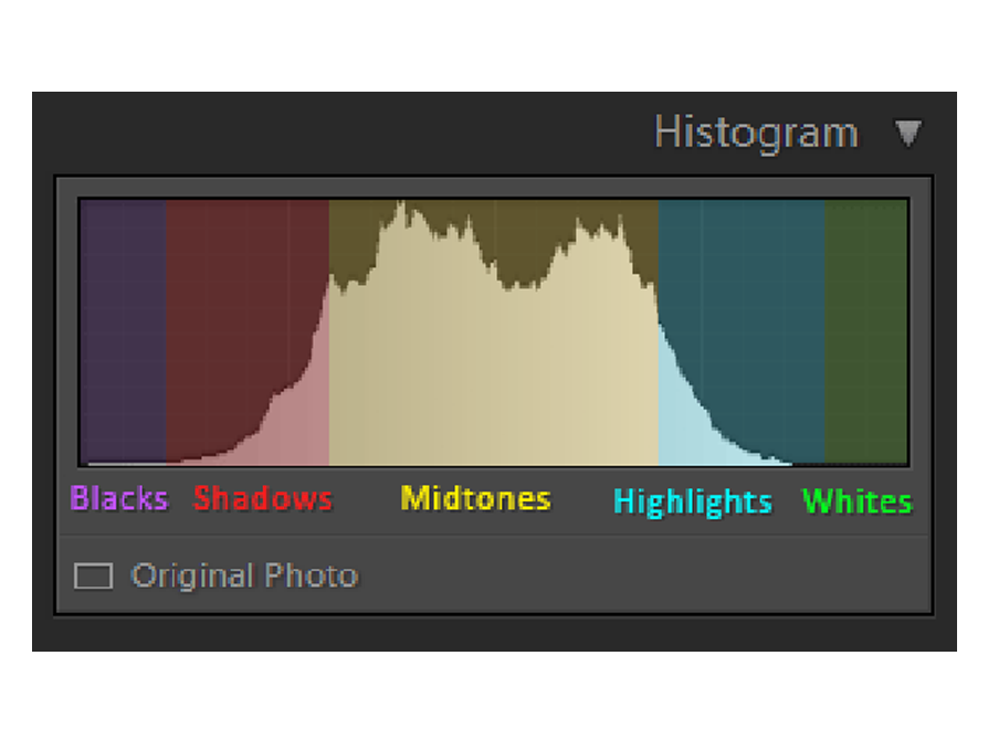
Image histograms depend on luminosity, to display lightness information, for each pixel contained on the image sensor.
UNDERSTANDING LUMINOSITY – BRIGHTNESS VS. LIGHTNESS
The following colors of yellow and blue have the same brightness, as viewed on the screen, but our eyes perceive this brightness differently.
-Compared to blue, our eyes perceive the brightness of yellow to be closer to white.
-Compared to yellow, our eyes perceive the brightness of blue to be closer to black.
Yellow has a higher perceived brightness value, known as lightness, when compared to blue.
On the tonal scale, blue’s lightness is provided on the left and yellow’s lightness is provided on the right.
Just remember, lightness is the perception of brightness, without color information, on a scale from black to white.
In this last example, we look at 5 different fully saturated colors at 100% brightness, along with tonal values of how the human eye perceives their brightness, also known as lightness or luminosity.
The brightness of pure green and pure magenta are exactly the same in the color example above.
Our eyes perceive their brightness to be slightly different as seen in the tonal values provided below each color.
The perceived brightness, known as lightness, of green is greater than that of magenta.
These techniques are the basis for color contrast & color theory as taught in the following section. Luminosity ( Lightness ) is one of the most important concepts in photography!
Now we will learn to control color using Hue, Saturation & Brightness.
WHAT IS HUE?
A hue is a color without any black, white or gray added to it.
A hue is known as a pure color.
Hues are shown in the graphic below. Usually, hues are labeled by degrees corresponding to their location on the color wheel circumference.
All hues are colors, not all colors are hues. To produce different colors, hues are tinted, shaded and toned.
WHAT IS TINT, SHADE & TONE?
Adding white to a color is known as Tinting.
Adding white to a hue, such as green, which lies at 120 degrees, produces different tints of green, ranging from pure green hue to almost white color.
As colors are tinted their lightness ( luminosity ) value increases, on the scale of black to white, known as the tonal scale.
A luminosity histogram, as found in cameras and photo editing software provides lightness values for each pixel. As colors are tinted, the histogram shifts to the right, towards white.
The three primary colors in the RGB Color model are shown below. Pure hues are found on the right.
As white is added, the hues become tinted, and the lightness increases. Any color that’s not pure white can be tinted.
ADDING BLACK TO A COLOR KNOWN AS SHADING.
Shading decreases the lightness value of colors, decreasing their perceived brightness on the tonal scale. When a color is shaded, the histogram shifts to the left, towards black.
Hues are found on the far right, as black is added they become shaded and appear darker.
ADDING GRAY TO A COLOR IS KNOWN AS TONING.
The graphic below shows the addition of 50% gray ( half black / half white ) to red, green and blue.
Toning doesn’t always have to consist of 50% gray, but can include all tonal values of gray.
WHAT IS SATURATION IN PHOTOGRAPHY?
Saturation is the purity of a color.
Fully saturated colors are hues or pure colors.
Non-saturated colors, known as tones, lie on the black to white tonal scale.
The more saturation a color has, the more vivid it looks to the human eye. The less saturation a color has the more washed out or faded it looks.
Adding white to any color, known as tinting, desaturates it.
Since toning adds white & black to a color it also desaturates the color.
Adding pure black, known as shading, does not desaturate a color, yet lowers it’s lightness value, or perceived brightness, shifting the histogram to the left.
In the graphic below, fully saturated hues, magenta, cyan and yellow are found on the far right. As the colors are tinted, and white is added, the saturation lowers.
As a color becomes more tinted and desaturated, the luminosity or lightness of the color increases, as the perceived brightness becomes closer to pure white. This shifts the histogram to the right.
You may also like